Responsive Beauty Website
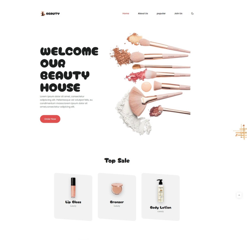
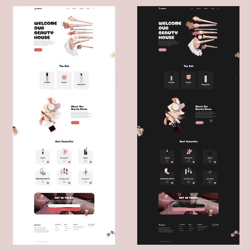
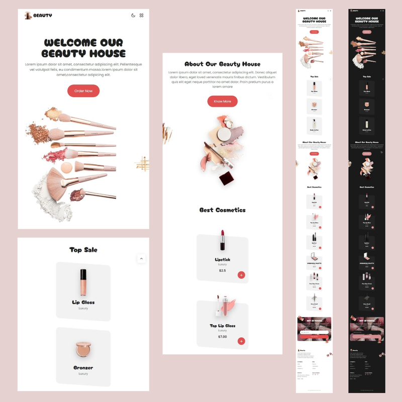
Live PreviewResponsive beauty website designed to showcase beauty products, services, and information while ensuring optimal user experience across various devices. With its responsive design, the website adjusts seamlessly to different screen sizes, providing easy navigation and readability.\n With both dark and light mode options. This allows users to select their preferred viewing experience, whether they prefer a bright, airy interface or a more subdued, night-friendly ambiance.
Features
-
Fully Responsive
-
Fluid Layout
-
Flexible Grids
-
Media Queries
-
Flexible Images
-
Viewport Meta Tag
-
Mobile Navigation
-
Breakpoints
-
Touchscreen Optimization
-
Device Compatibility
-
Fluid Typography
-
Flexible Forms
-
CSS Flexbox and Grid Layouts
-
Device Orientation Support
-
Responsive Images
-
Cross-Browser Compatibility
-
Flexible Text
-
Fluid Animations and Transitions
-
Responsive Typography
-
Scalable Vector Graphics
-
Neat, clean and simple design
-
Google Fonts
-
Layout – Responsive
-
E-commerce Functionality
-
Advanced Filtering and Sorting
-
Performance Optimization
-
Performance Budgeting
-
Touch Gestures and Interactions
-
Dynamic Content Loading
-
Adaptive Navigation Menus
-
Form Optimization
-
Search Engine
-
Multi-platform Compatibility
-
Accessibility Features
-
Menu Display
-
Product Details
-
Product Zoom
-
Pagination
-
Contact Information
-
User-Friendly Code
-
Easy to customize
-
SSL Certificate
-
SSL Security